Feeding America
Feeding America
How might we develop a digital interaction that young professionals find easy to notice and use and thus feel prompted to take action by donating?
Skills Used
Discovery Research
Conducting Client, Competitor and User Research to Uncover the Problem
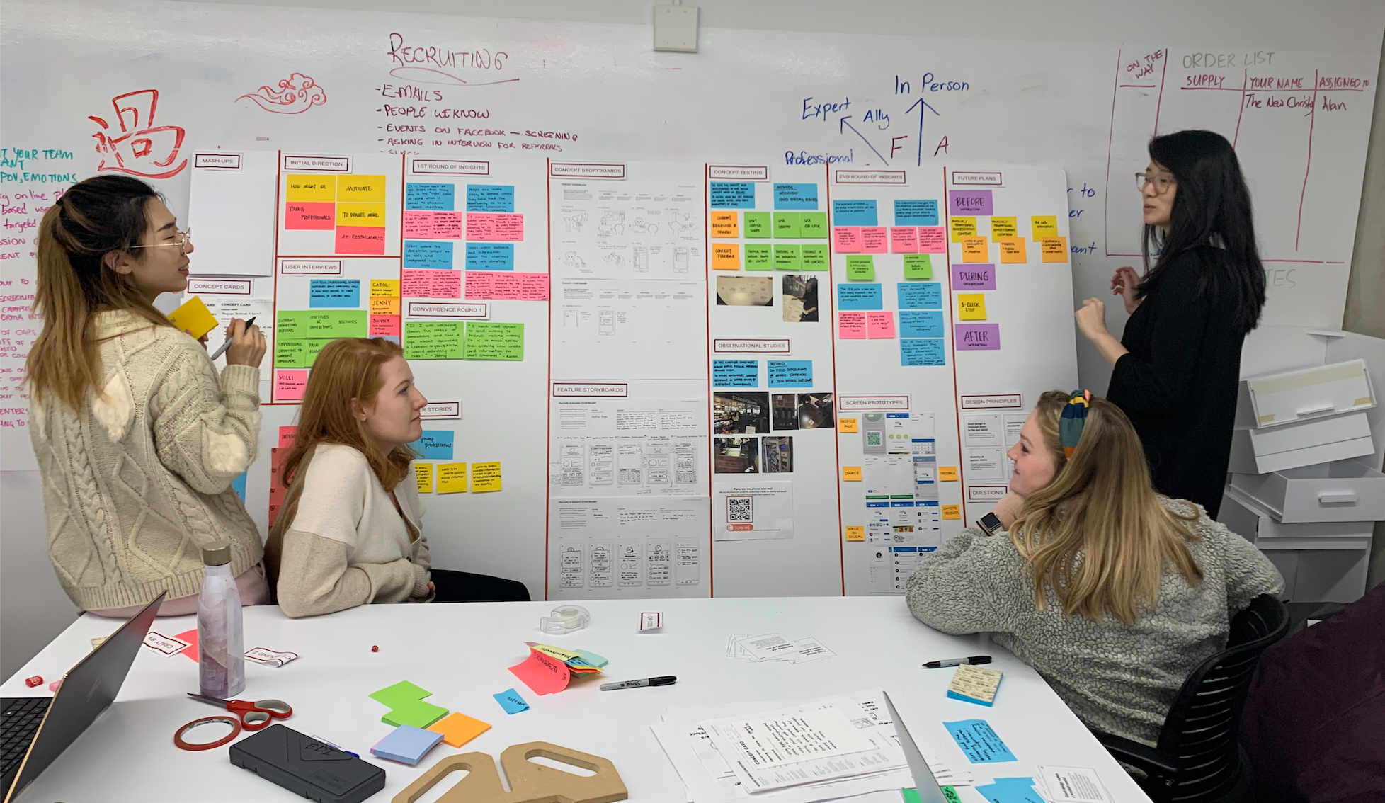
As a team we were given a project brief by Feeding America stating: How might we create digital interactions that get more people in grocery, retail or restaurants engaged in the fight to end hunger? However, after this initial brief it was our team’s job to narrow the scope and decide on a specific user, objective, touchpoint and interaction. We thought a good place to start when determining these things was to do an assessment of the current landscape. We looked into current Feeding America digital campaigns as well as digital campaigns run by other charitable organizations. We used InVision to capture our findings from this assessment and these findings can be seen here. This assessment was used to determine what was currently working, what wasn’t and where the gaps were. After this my team decided to narrow our target consumer to young professionals. We thought this was a lucrative space because we saw a lack of specific targeting for this group and felt that the recent financial independence of young professionals provided an interesting opportunity. Once our scope was narrowed in terms of target customer we conducted 8 client interviews with users in our desired demographic to narrow our scope in terms of objective, touchpoint and interaction. From these interviews we hoped to learn more about our user’s current opinions of and feelings towards charitable action and donating. During these interviews we made use of research methodologies such as card sorting to uncover major pain points surrounding charitable action for this age group.
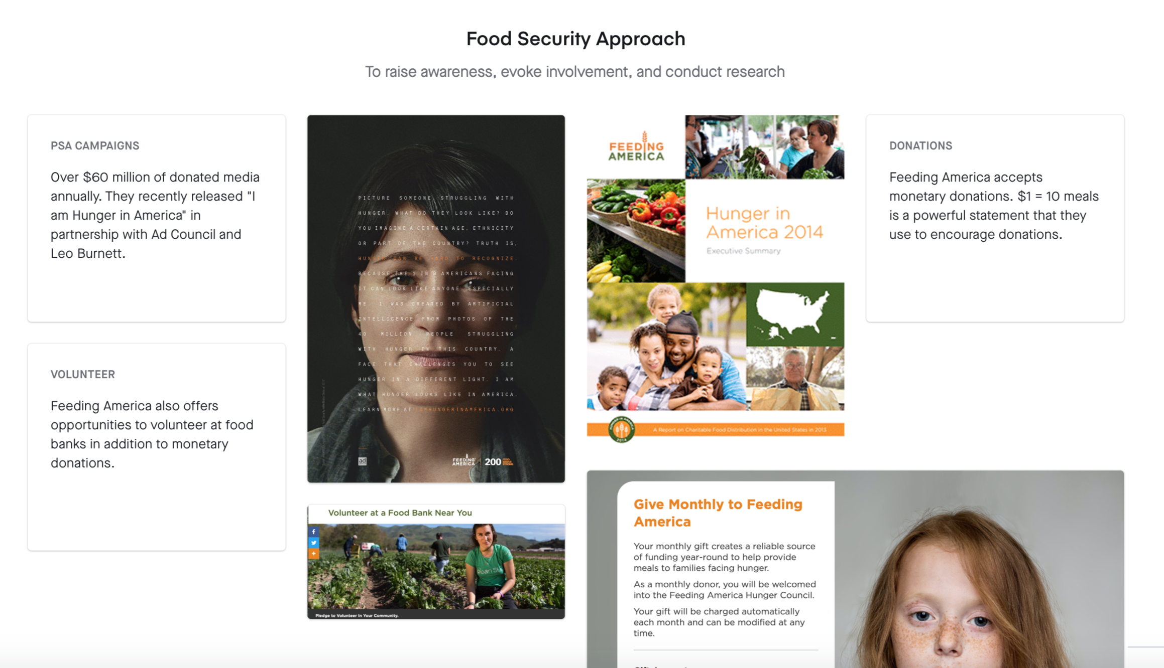
Results of current landscape assessment.
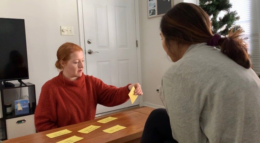
Running through the card sorting activity with a user.
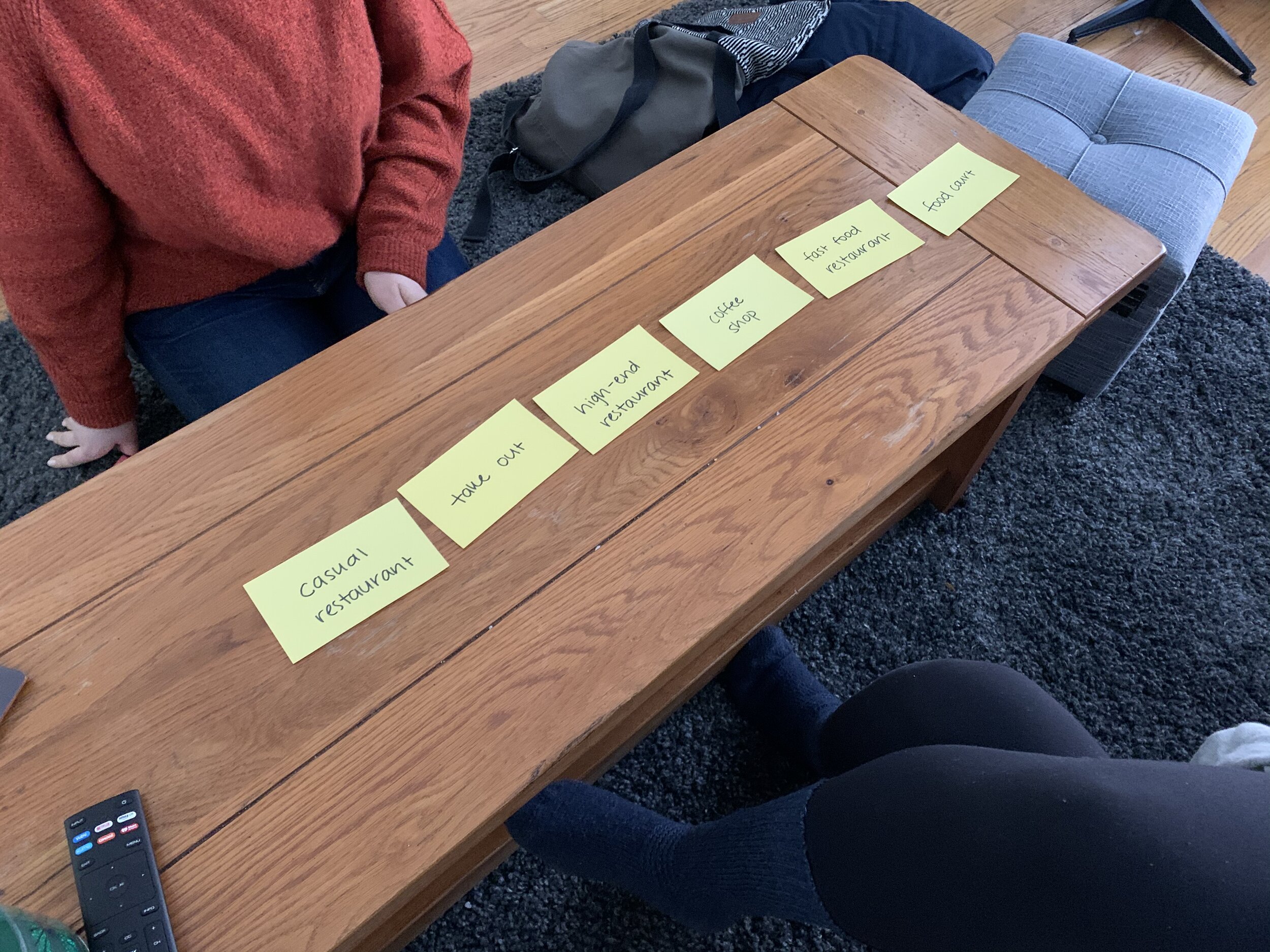
Results of one user’s card sorting activity.
Concepting and Ideation
Using Research Insights to Narrow on Concept
After our initial user interviews we synthesized our results so that we could move forward with a concept. We uncovered a few key insights through our synthesis. For example, users in this age group want a seamless interaction, they want to have some sort of tangible feedback regarding what their contribution is going towards and they also like to see what charitable action other people in their close social circle are engaging in. With these key insights in mind, we did a few quick brainstorming activities such as Crazy 8s to come up with as many concepts as we could. After analyzing these concepts we decided on one that we felt allowed us to address all of our key insights. Our concept, VenmoMeals, is an interaction that presents users a seamless and quick way to learn about and make donations through the Venmo app. Once we decided on our concept we used the 5Es framework to storyboard our idea. We used this to consider how the user would interact with our interaction at the excite, entry, engagement, exit and extension stages.
Design and Prototyping
Realizing Features in Figma
After we decided on a concept, we conducted a comparative feature analysis in which we observed how other organizations were using the features we deemed necessary for our interaction. After gaining inspiration from this analysis, we created breakdowns of each feature by sketching the screens the user could expect to see at different stages of the interaction. We also spent a lot of time thinking about the user stories when they were engaging with each of these features. These user stories allowed us to better understand what the user might need at different points of the interaction. After doing this feature analysis we conducted 8 more user interviews this time surrounding our concept. We again made use of card sorting to see which pieces of information and features were most important to users. These concept interviews also gave us insights into how receptive users were to our idea. Using what we learned from the comparative feature analysis and concept testing we made adjustments to our screen sketches and started prototyping the screens in Figma. Initially, we decided to mockup the screens for all of the main interactions we had decided on and talked to our users about. This included interactions such as a Feeding America Venmo profile page, paying/donating to Feeding America, sharing your donation, inviting friends to donate individually or as a collective, donation history, home page notifications prompting users to donate, donation subscription, rounding up a payment and ads to donate in a user’s community feed. Once we created wires for these screens in Figma, we presented them to our professors and the team at Feeding America. From this we received feedback on which interactions needed to be flushed out more and on things related to aligning with Venmo’s current brand and model.
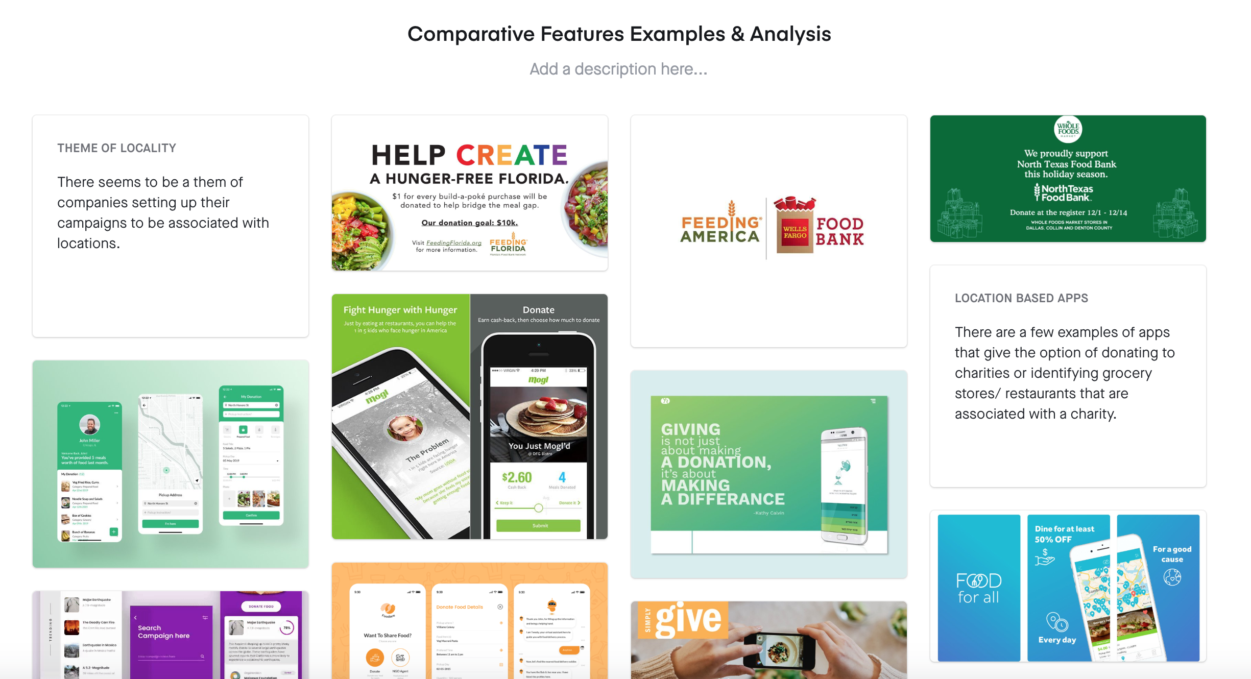
Comparative Feature Analysis
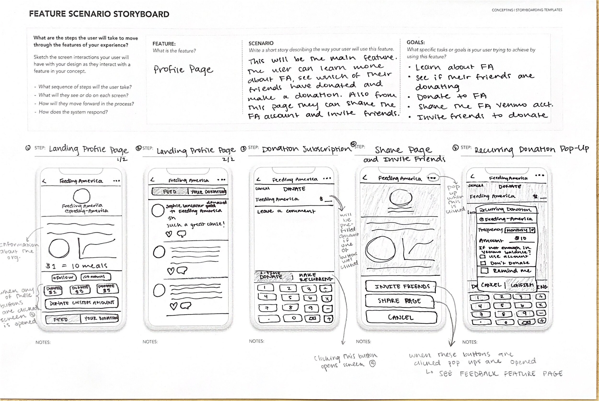
Feature Storyboard
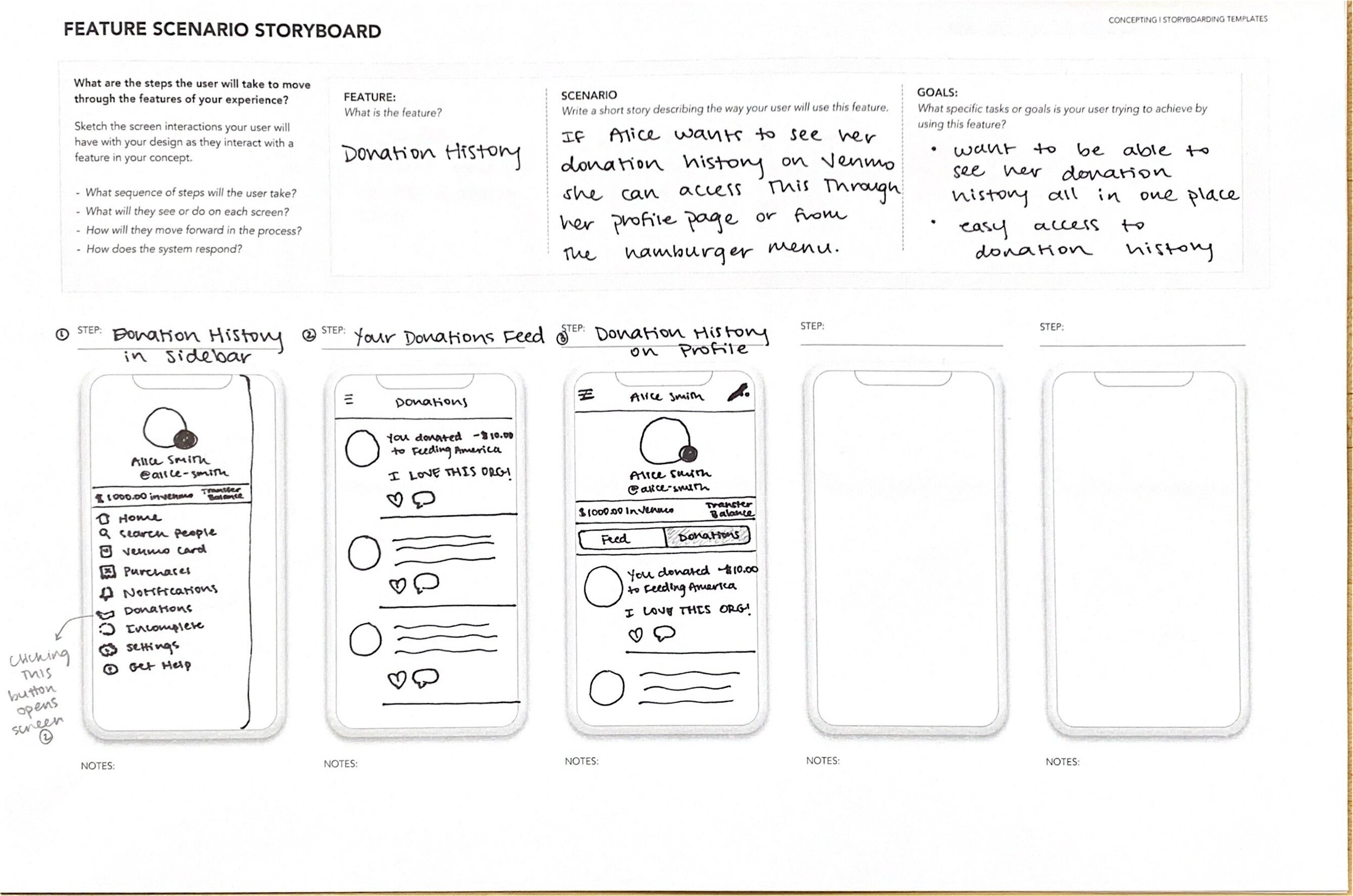
Feature Storyboard
Evaluative Research
Task-Based Testing and Gauging Interest
After following an iterative process to create screens for our interaction in Figma, we conducted a final round of evaluative interviews with our users. The goals of the final, task-based interviews were to better understand which features were most appealing and easy to use, gauge how likely people would be to use this interaction, understand how to prioritize information and gauge the appeal of different points of entry. In order to realize these goals we did a few different activities. First, we asked users to complete tasks such as donating $5 to Feeding America, paying your friend $3.47 and rounding up your payment and inviting friends to donate as a collective. During this task based testing we made sure to keep track of any notable observations while the users were completing each task. Next, we asked users to do an activity in which they chose where to put certain pieces of information on Feeding America’s Venmo profile page. Finally, in order to gauge which points of entry were the most appealing to users, we showed them a few different options and had them comment on what they liked and did not like about each.

Task-based testing with a user
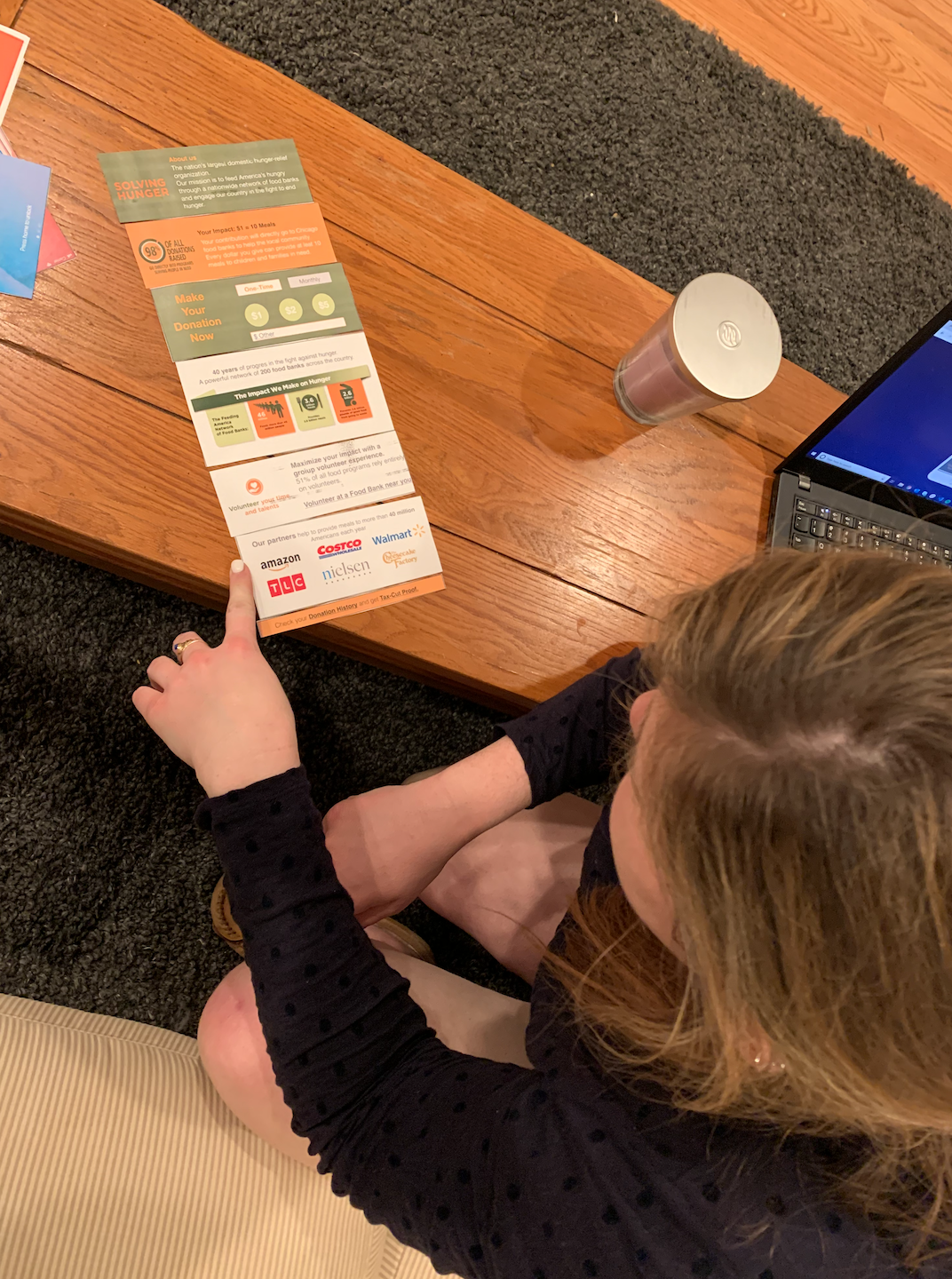
User prioritizing information for Feeding America’s Venmo profile page
Final Solution
Prioritizing for Client Presentation
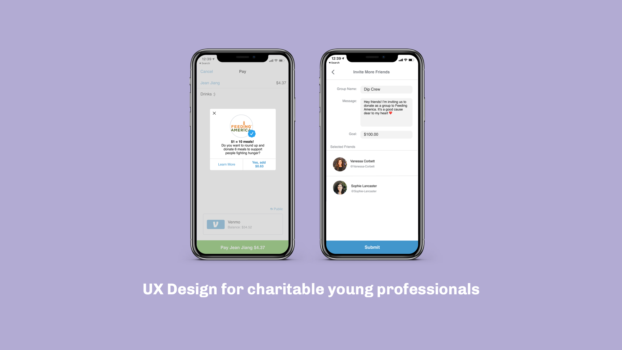
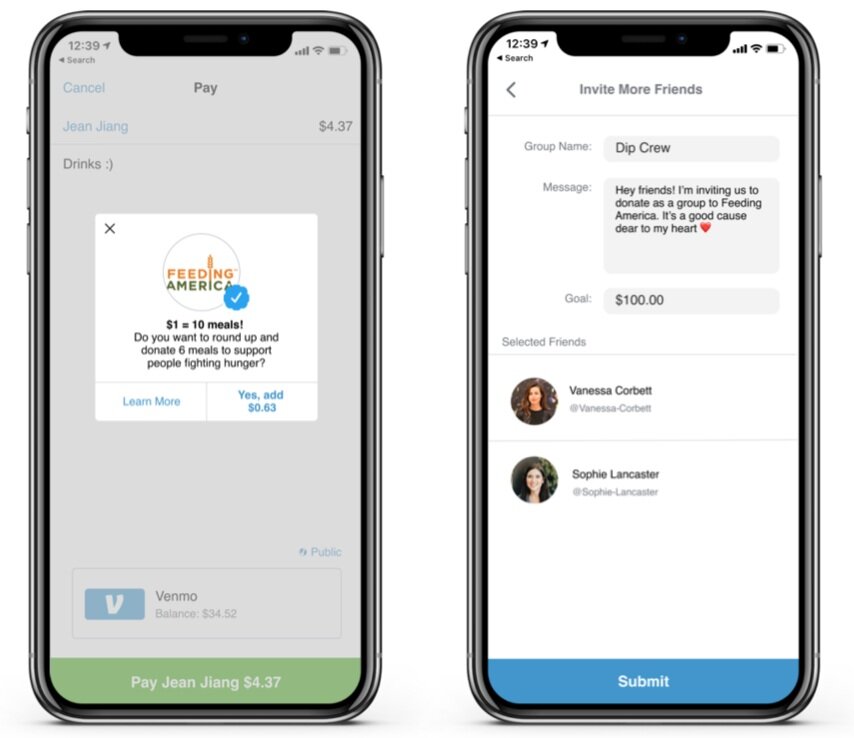
Based on our final round of research we chose three features within our interaction to focus on and highlight in our final client presentation. The final features we chose to include were roundup, invite and the Feeding America profile page. The final designs of all three of these features can be seen below and can be found here. Additionally, in our final presentation to Feeding America we decided it was important for us to highlight the different points of entry into the interaction. This part of the process was something we had discussed with our professors and the Feeding America team earlier on in the quarter and so we wanted to update them on what we had learned about this after doing more research with our users.
Invite friends feature
Feeding America Venmo profile page
Round up feature
Different points of entry
Potential Impact / Future Steps
In our final presentation to Feeding America, it was important for us to introduce the problems currently faced by our target audience and explain how our solution, VenmoMeals, addresses these problems. However, it was even more important for us to discuss the impact this solution could have for Feeding America. By using Venmo, Feeding America automatically gets access to a customer base of 40 million users. Drawing on data we found online, if we assume that 60% of Venmo users make a monthly donation of $1 though the app, Feeding America would get $288 million in Venmo donations each year. Additionally, using a social media platform such as Venmo would allow Feeding America to attract and retain more donors and increase its social presence. The final impact of VenmoMeals that we chose to highlight in our final presentation, is that it lowers the barrier to entry by allowing for seamless transactions that will not interrupt the user’s lifestyle. Due to all of these things, we believe that VenmoMeals is a viable, feasible and desirable solution for Feeding America and we look forward to seeing what they do with the idea in the future.
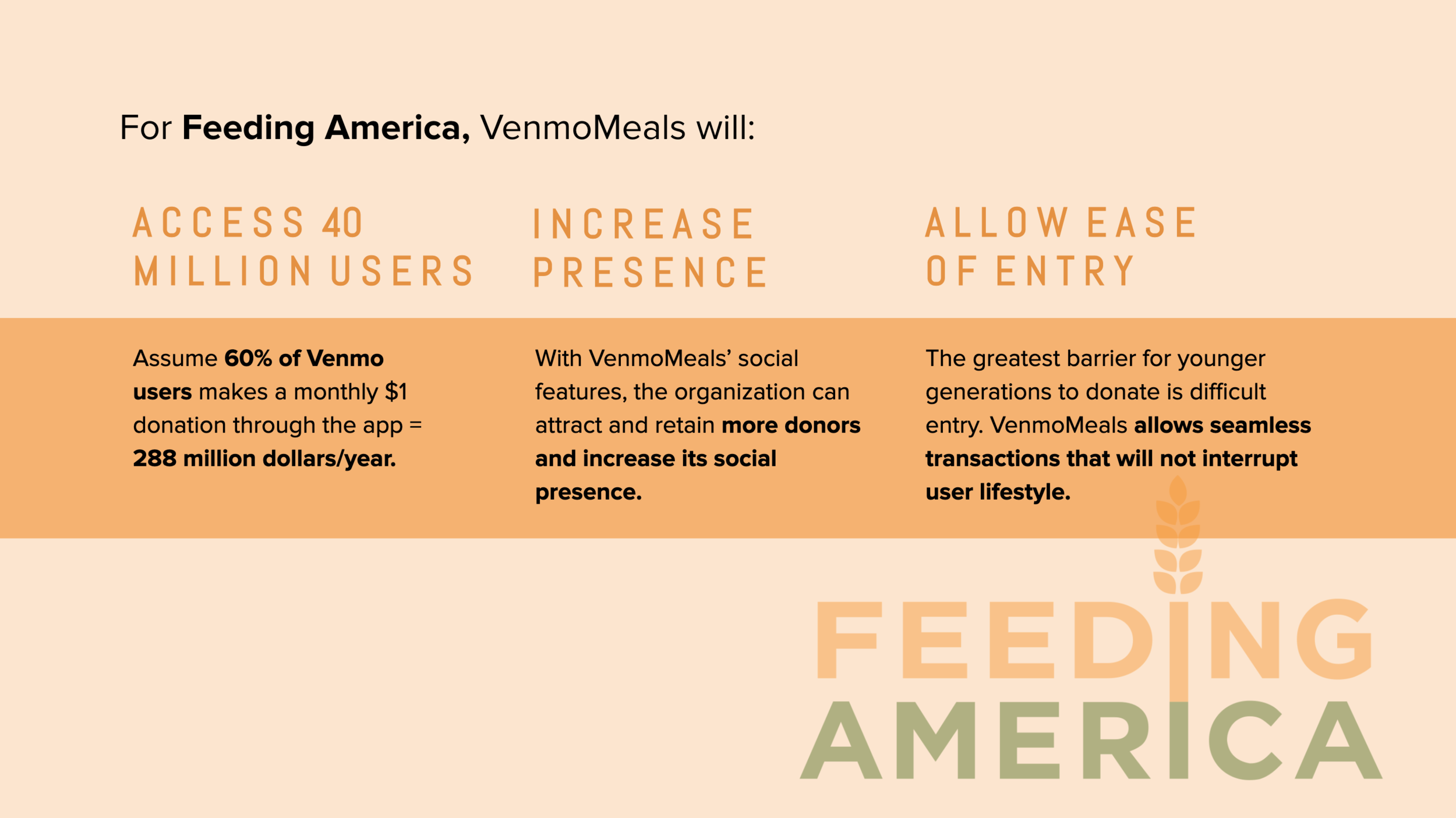
Potential impact for Feeding America
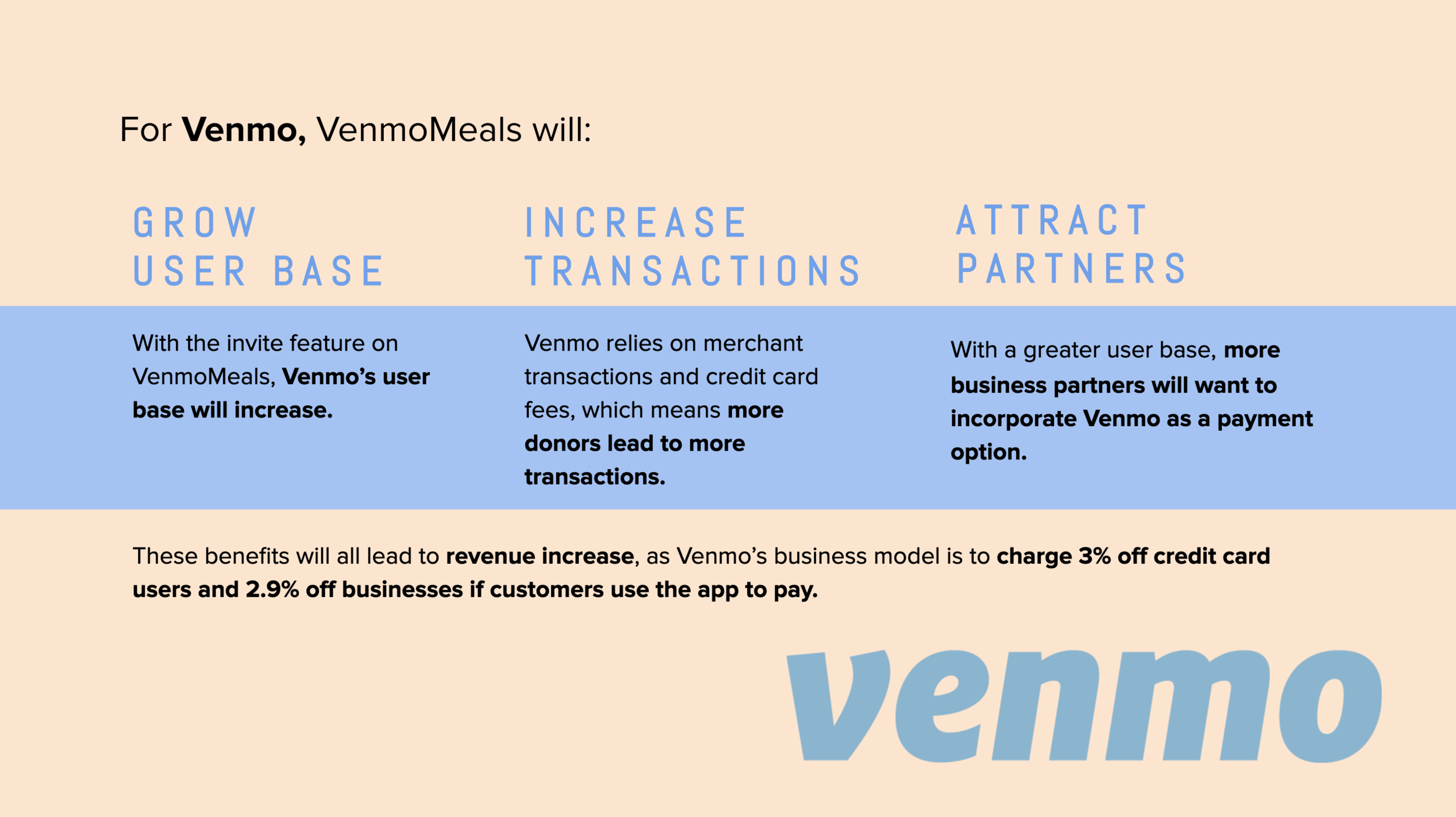
Potential impact for Venmo
Key Takeaways
It is not that important to flush out all of the micro-interactions. Instead it is more important to think about the WHOLE interaction. This is why the points of entry became so important for this project.
The way you pitch to a client is so important. We did so much work in this project that we didn’t have time to talk about during our presentation. Because of this, we had to choose the main differentiators/selling points of our solution and focus on these. Additionally, when presenting it is important to show that you know your client. For this project we knew how important it was to show Feeding America the impact our solution could have for their business and because of this we chose to use statistics and provide them with a number which really captivated them.
Don’t force an interaction that you know won’t work. In this project we quickly found out that QR codes was not an interaction that was going to work for our solution. Instead of being discouraged by this we used it as a way to come up with creative alternatives. This is a learning and changed mindset that I will definitely take forward with me.
Contributions
I would like to say a special thank you to my project team members, Jean Jiang, Vanessa Corbett and Mengxue Bi, my professors Susan Curtis, Jesse Wilbur and Tom Quish and those who contributed through user research.
